Here’s something to chew on:
I’m a numbers guy. Â I always like seeing where money is flowing, how the typical family spends their money, etc., especially across various countries. Â The preceding infographic breaks this down in quite a bit of detail. Â It’s quite interesting to see how the demographics have changed from the 60s to present day and where funds are flowing. Â Take a look!
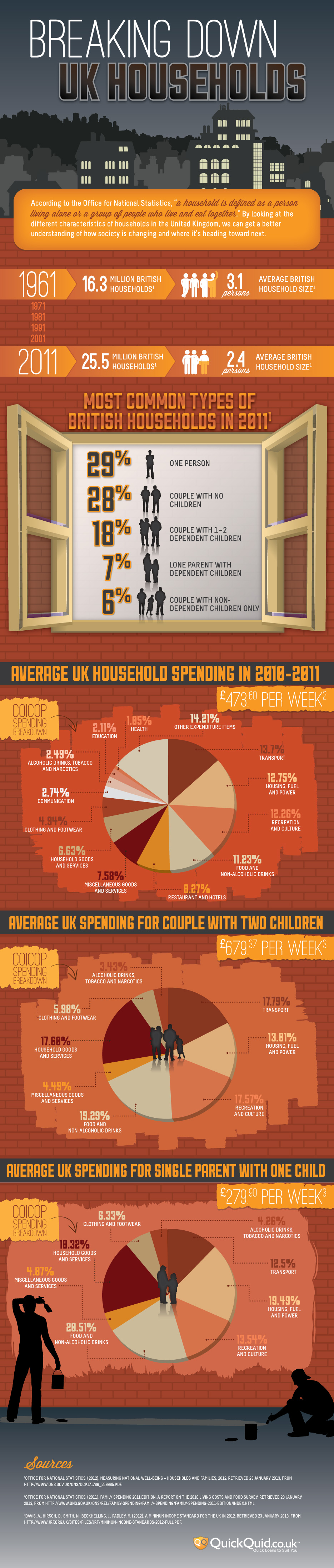
Source: QuickQuid
{ 0 comments… add one now }